This time it’s about mobile phones.
I have had recent occasion to use a Nokia N95. On paper it has all the bells and whistles. In reality it is a cumbersome lumbering beast (please refer to my earlier entry about the Motorola Razr).
Physically, there is nothing terribly wrong with the form factor of the phone. It has a vast arrray of features, all of which seem good… on paper.
The front end has been customized by vodafone, but that’s all candy. The usability is terrible.
It doesn’t know what country I live in, so therefore it does not match non-country coded numbers with the entry in the address book. A problem so simple that my helper monkey could accomplish it. As a result when friends ring and I’ve explicitly stated ‘only my friends group can call me’, I get nothing because the phone can’t match the number to the entry in the address book. kind of like. Dear f**king christ, it’s not that hard to drop the leading zero and match with any numbers that match the country code you’re in. This is not f**king rocket science.
On the front panel we have a 4-way bar surrounding a button, and 8 other items surrounding it. There is the ubiquitous ‘green’ button, which only works when you’re expecting a call; otherwise it it about as useful at a tit on a bull. there’s the red ‘get me the f**k out of here’ button, which is about as useful as a granny with epilepsy (as you hit it more often than the buttons surrounding it due to the poor response. There’s a ‘clear‘ button, which is supposed to delete characters. It’s so small that my stubby fingers press the red button more often than this one. There’s a ‘pen’ button. I have no clue what it does. Apparently it did something at some time. What it did and what it’s function are are lost on me as it seems to be completely useless. There are two blue ‘multi-function‘ buttons. This means that they do what the two items at the bottom of the screen say. Then there is the ‘shortcuts’ button, which pops up some form of paged navigation thing (poorly implemented), and the menu button which pops up the ‘menu of doom‘ when pressed lightly, but when held displays a popup of all the running applications.
The menu of doom is this crazy rube goldberg style navigation system where you only know where things are based on your previous knowledge. And what knowledge will you need to have. There is a vast disordered mess of settings and applications the location of which needs to be discerned by experimentation and memorization. Even then, there is little chance you will be able to remember what it is that you’re looking for so you will need to pop it up to the standby screen. Where in other phones the reason for placing something on the quick access menu was due to it being slow to access, in this case it’s because you will never be able to find it again.
On to using the phone. Receiving calls is simple. Press green and you’re in. Whoopee f**king doo, Nokia have remembered that it’s a phone after all. Unfortunately, they’ve obviously left the usability engineers locked in a cave for the last 10 years. Nothing has improved. It’s like they’re stuck in the ice age with regards to functionality.
We wander through the entries in the address book. I get a list of names. You have to open the contact, choose the number, click the left button to get the options for this item and then choose to make a voice call (it may do a voice call on the center button, but as there’s no way to know based on the complete lack of UI on what happens when you press the center button, you’re kind of shooting in the dark on that one).
Text entry is a crap-shoot. Some of the fields take predictive text, some do not. Most of the times you expect it to be predictive text it isn’t and vice versa.
Call logs only tell you that you called a number. All the entries are mobile phone icons, so you don’t know if you called the house, the mobile or some other number. There is no uncomplicated way of calling one of the alternate numbers for a contact from a call entry in the log. There’s no way of knowing if the dialled call was received or not (dear god this it first year usability here). There’s no record of how long the call was.
While this is a fully featured phone, it provides them in such a manner as to be practically unusable. Informing the user that they need to learn how to use a phone like this is counter-productive. a phone like this should provide all the needed features in an easy and intuitive manner. The poorly oriented, badly designed button arrangement on the frond end is anything but that.
I would not recommend this phone to anyone except the most hardened masochist. I will return to a more sensible phone as soon as possible.
What a piece of crap. Really, and they expect people to use this shite?

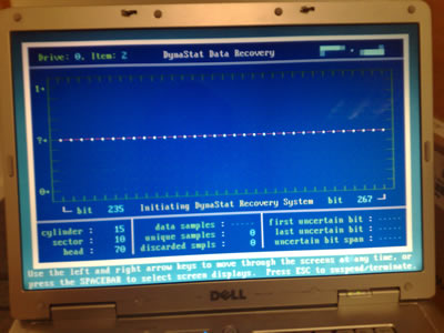 The hard drive in the big laptop gave up the ghost two days ago. I’m running spinrite on it to recover as much data as I can before kicking the drive onto the kerb. It seems to have been a perfect storm of badness happening to me this last week. On the plus side, at the pool party last night I found a tenner in the corner pocket of the table I was playing on, so it wasn’t a complete wash.